
Digital Influx - Product Design
Company Project / Insights
Digital Influx is an international EdTech company specializing in Design and Product. The mission is to bridge education and employment through innovative e-learning methods, interactive activities, and engaging games.
Time 2 months
Tools Figma, Fig jam, Canva, Trello, Teams
Team 3

The Problem
Digital Influx, an EdTech company, wanted to support its initiative of providing free UX design courses to underserved K–12 students by raising donations and sponsorships. However, their existing website lacked the clarity, emotional connection, and focused messaging needed to effectively engage potential donors. This created the need for a dedicated Foundation platform that could better communicate the impact of their mission and inspire support.
My Role
My primary role was end-to-end product design for the Foundation website. Apart from that, I also worked on the Digital Influx Academy platform, where I conducted UX research, applied targeted strategies that enhanced course engagement by 25%, and designed a UX case study template for student materials.
Key Outcomes
60% Increase in Task Completion Rate
With clearer navigation and a more streamlined donation process, the task completion rate for donations increased by 60%, showcasing the effectiveness of the design adjustments.
Reduced Donation Form Discovery Time
We reduced the time it took users to find the donation form to under 20 seconds, a significant improvement over the previous version of the website.
30% Increase in Usability The feedback from the usability tests helped refine key elements of the interface, resulting in a 30% improvement in overall usability.
Design Process
We followed the Double Diamond model to guide our design process, breaking the project into four phases: Discover, Define, Develop, and Deliver.

Understanding Gaps in the Existing Experience
Before designing the new Foundation website, we aimed to understand the challenges users faced with the existing donation and sponsorship experience on the Digital Influx Academy website. To gain a comprehensive understanding of the user experience, we reviewed analytics, conducted usability testing, and ran a survey to uncover key pain points and user expectations.

Analytics Review
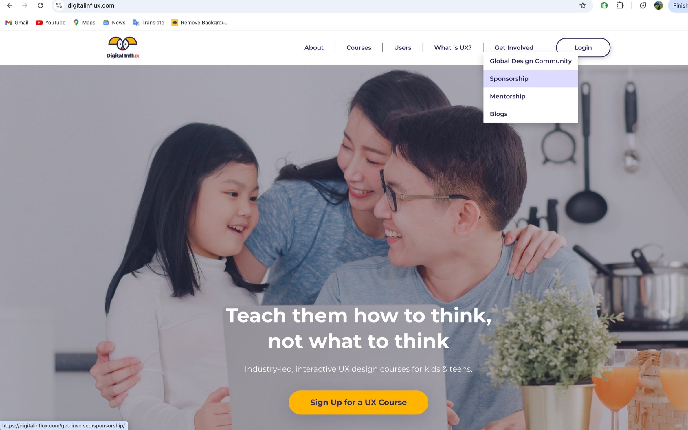
Limited Visibility: The sponsorship page was buried under a “Get Involved” dropdown, resulting in only 5% of visitors engaging with the page. This lack of visibility contributed to low donor participation and indicated poor usability in navigation.
Usability Test findings
Navigational Challenges: Users had difficulty finding essential actions, particularly the donation form. On average, it took over 1 minute to find the donation page, leading to a 50% task completion rate.
Survey Insights
In addition to the analytics and testing, the survey provided valuable insights into user perceptions:
70% of respondents could not distinguish between “Get Sponsored” and “Become a Sponsor,” leading to hesitation and drop-off.
65% of users said the content lacked emotional appeal. They wanted to see real stories and impact-driven messaging to feel more connected to the cause.
User Persona Development: Understanding our audience
To ensure the new Foundation website met the needs of its intended users, we focused on better understanding the existing audience. Our primary user groups included:
Tech & Design Professionals
Charity organisations
Educators
Non-profit groups
To capture their perspectives, we conducted a survey with 29 participants and followed up with 5 in-depth interviews. These methods provided rich, actionable insights that directly informed the design direction. These findings directly shaped the user personas that guided our design decisions throughout the project.
Key Findings
Transparency in Donations
78% of participants emphasized the importance of knowing exactly how their donations are used.
Emotional Connection
Users wanted to feel more connected to the mission. One participant shared, “I would feel more connected to the cause if I could read about real students and their stories.”
Donation Preferences
79.3% preferred making one-time donations, while 13.8% opted for a monthly subscription model.
Social Media Engagement
64.8% engaged with organisations through social media and wanted easy sharing options. Users also noted they’d be more likely to share the cause if the functionality was clear and accessible.
Navigation and Usability
Participants experienced friction in the donation process. One user commented, “It took me a minute to figure out where to click to donate. It could be more straightforward.”

Competitor Analysis: Learning from Industry Leaders
To design an effective and engaging Foundation website, we conducted a SWOT analysis of five existing donation platforms to identify common patterns, strengths, and areas for improvement. These platforms helped us understand what makes donation experiences intuitive, trustworthy, and emotionally resonant.
After gathering detailed observations, we synthesised the data to remove redundancies and extract meaningful, non-obvious insights that would directly inform our ideation process.

Translating Insights into Action
Based on all the insights gathered from user research and competitor research, we identified key design priorities to guide the development of the new Foundation website.
Highlight Brand Identity
Simplify Navigation
Increase Engagement
Facilitate Communication
Enhance Trust & Transparency
Improve Donation Experience
Feature Mapping & Information Architecture
To translate the insights from competitor platforms into actionable steps, we aligned them with our defined design priorities. However, given the wide range of potential features observed, not all of them were feasible or necessary for our foundation website. To streamline decision-making, we used the MoSCoW method (Must-Have, Should-Have, Could-Have, Won’t-Have) to categorise features based on their relevance to user needs and business objectives.

Design Decisions
After prioritising the features and understanding user needs, we made several design choices to improve the overall experience of the Foundation website:
Include a clearly visible “Donate” button in the main navigation, along with donation prompts placed across key pages for better visibility.
Add social media links in the footer to help users follow and share the initiative easily.
Highlight partner schools and student testimonials on the homepage to create an emotional connection and build credibility.
Simplify the donation process by replacing long text forms with dropdowns and radio buttons for a quicker, more user-friendly experience.
Introduce a short About section on the homepage, with a link to a detailed page covering the organisation’s story, mission, vision, and team.
Follow Digital Influx’s brand identity by using the existing colour palette and design style for visual consistency.
We began by creating user journeys to map out key interactions and identify user expectations across the site. Based on these journeys, we developed a sitemap to organise content logically and ensure smooth navigation.

Following this, I developed a user flow to illustrate how a user would navigate through the entire website. It helped ensure that each step from landing on the homepage to exploring content and making a donation, felt smooth, purposeful, and aligned with user goals.

High-Fidelity Wireframes
Once the flow was finalised, high-fidelity designs were created to translate the structure into a polished and engaging interface. To highlight brand identity, a colour theme was chosen from Digital Influx’s existing palette, ensuring visual consistency while making the experience feel familiar and trustworthy.
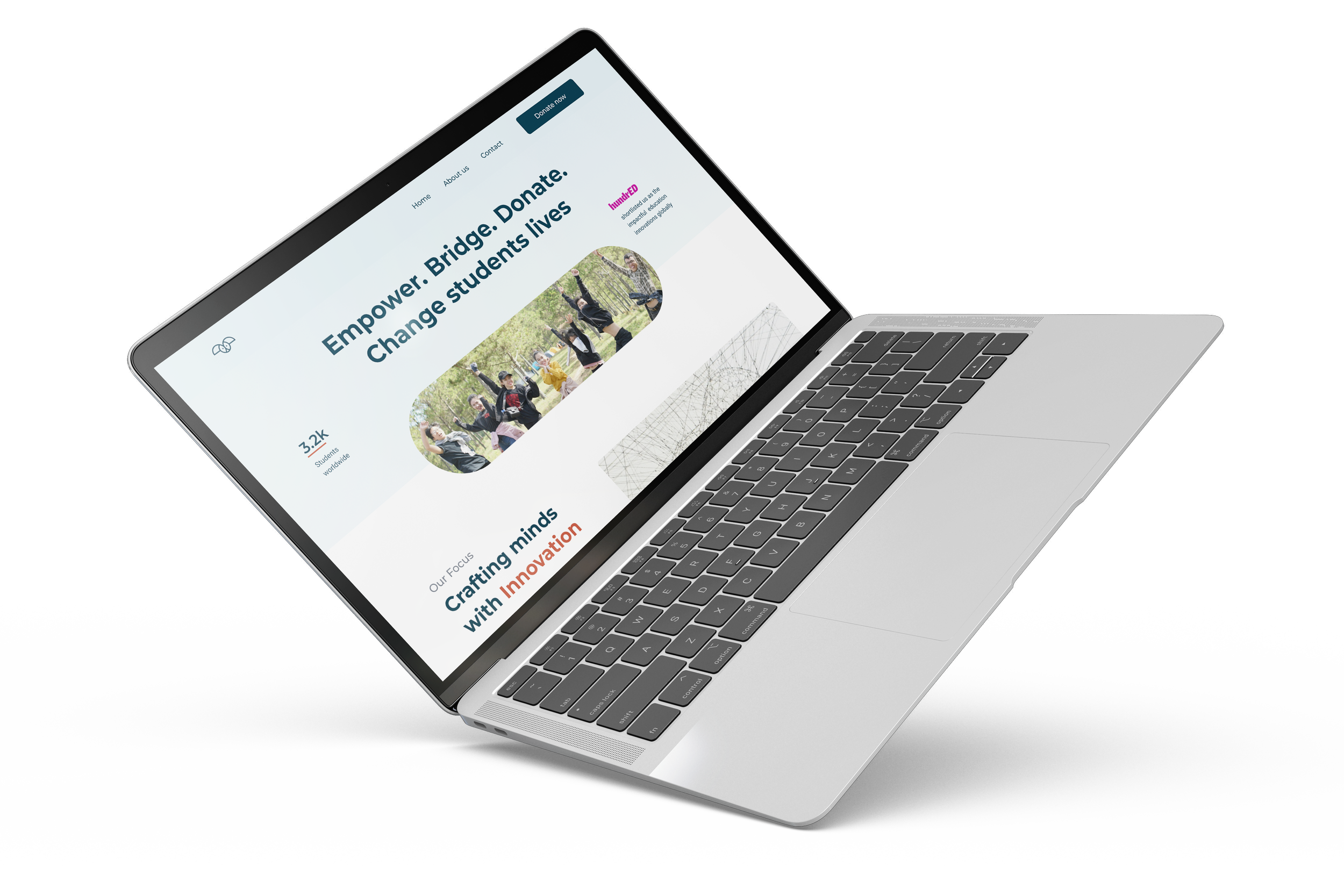
Home Page
The new homepage showcases student testimonials and highlights our partnered schools, enhancing trust and transparency. It provides clarity on our focus and communicates who we are as a company and what we do.
The navigation bar is streamlined for ease of use, enhancing the overall user experience. This change was well-received during user testing.

New navigation menu


Old navigation menu
Donation request form page
The donation page features a more organised and informative design, including a simplified donation form paired with an FAQ section for user assistance. It also provides flexible donation options, allowing for both one-time contributions and monthly subscriptions. To address our target user groups, the form allows users to indicate whether they are individual donors or company representatives.
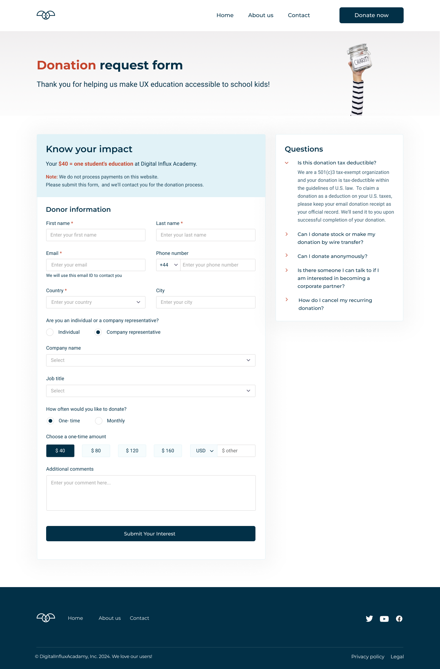
New donation request form page

Old donation request form page
Contact Us Page
The Contact Us page is now more organised and offers an easier way to reach out. It includes a messaging form along with essential contact details for seamless communication. Additionally, social media links have been integrated to align with users’ preferred communication channels and enhance engagement.

New contact us

Old contact us

About Us Page
The About Us page includes our story, mission, global reach, vision, and team. The website adheres to brand guidelines, ensuring that key messages are prominently featured.
Delivered Prototypes
To ensure the new website design was intuitive and user-friendly, we created interactive prototypes for the web version. These prototypes allowed us to simulate the user experience and gather valuable insights before the development phase. We conducted usability tests with real users to validate our design choices and optimise user interaction. These tests showed several key improvements.
Following the success of the web prototype, we created responsive designs for the mobile and tablet versions of the website. This ensured that the website would deliver a seamless experience across different devices, catering to the growing number of users accessing websites from their smartphones and tablets.


Learnings and Reflection
This project taught me how important it is to listen closely to users and uncover what they truly need, especially when working on something entirely new. I realised that even with the best intentions, a product can struggle to engage if the experience does not match what people expect or connect with emotionally. It made me more aware of how clarity and trust influence the way users interact with a platform. I also learned that small changes in content or structure can completely shift how confident and connected people feel. This experience strengthened my ability to approach problems with empathy and focus on creating meaningful, impactful experiences. Working on something from the ground up taught me patience and helped me embrace the uncertainty that comes with building for impact. It made me appreciate the value of asking the right questions, staying curious, and letting user needs guide the process rather than relying on assumptions.